The successor to the Nissan 370Z had been a long time coming. The sports coupe, which debuted in the market in 2008 and entered production in 2009, has reached maturity beyond usual; in a year the 370Z would have reached its teenage years.
As the cliché goes, better late than never. Finally, we can now see what the next-generation Z car through the recently unveiled Nissan Z Proto. As the name implies, it’s the prototype form of the next Z car that’s rumored to bear the 400Z nameplate.
But beyond the glitz and the glamor of the newly minted Z sports coupe’s launch, there are things about its design that needs to be discussed. It’s a common consensus among the media and enthusiasts that the Z Proto carries a polarizing design.

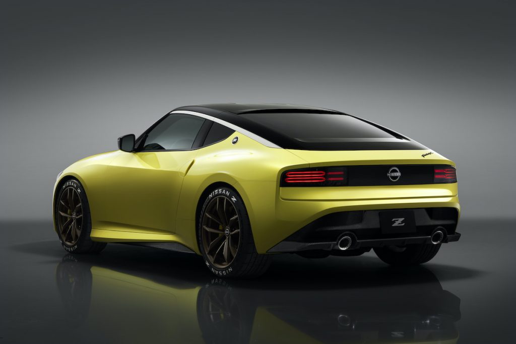
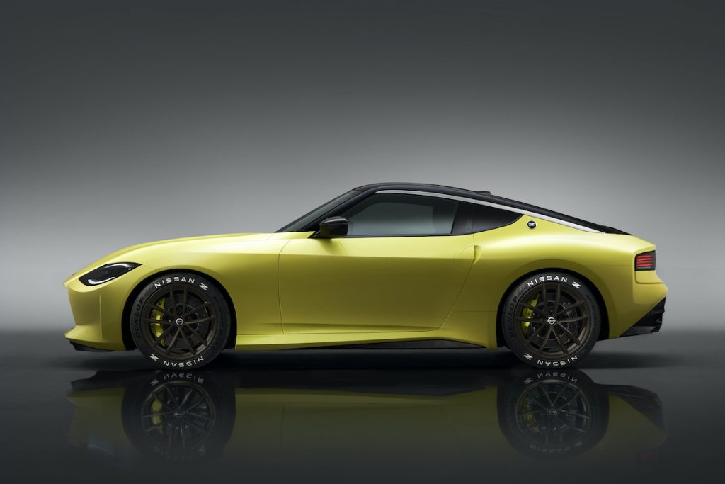
I, for one, lean towards hating some parts of it while the rest is pretty much outstanding, such as the lines when viewed in profile and the familiar taillamps. It is indeed a modern interpretation of the classic 240Z with a bit of a callback to the 300ZX at the rear.
But, as with any other car in the market today, there are things that need to be improved on the Z Proto that will hopefully transcend into its production model that’s due next year.
That comical grille
Automotive grilles have evolved from just points of ventilation for the engine bay to now visual identities of cars. They make vehicles instantly recognizable in one glance, and in most cases, serve as a signature of the car brand itself.

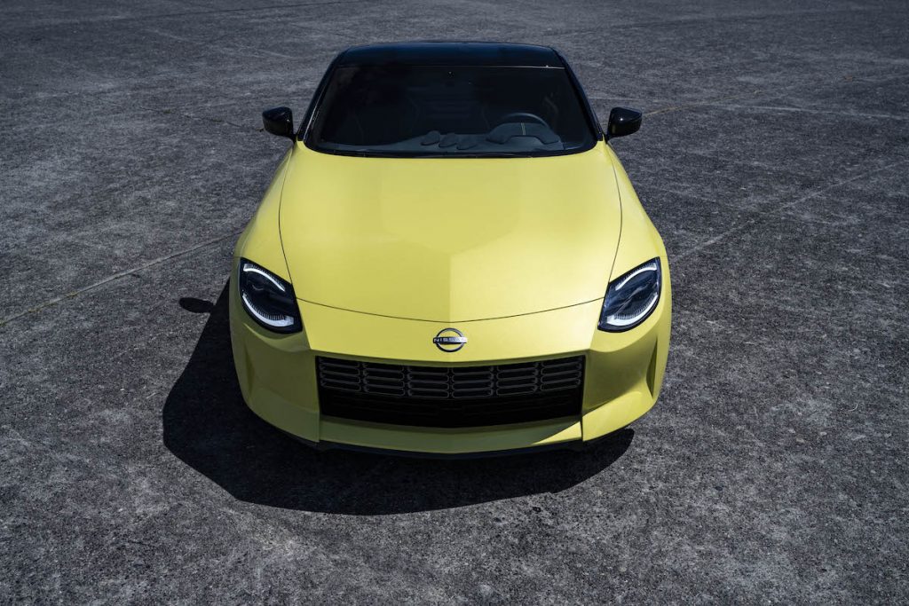
For the Z Proto, some say that the massive squared-off grille is lazily designed. I think that it could have been done better, and the main reason that it doesn’t work is that with the vertical extension for the bumper (to reduce lift) and without the chrome bumper from the 240Z, the grille is left to stand alone as a massive gaping hole. Worse, that rectangular shape isn’t congruent with the rest of the design that’s filled with sleek curves and sharp lines.
We’ll give Nissan this – it’s a one-of-a-kind execution but and in keeping with the Z car tradition but in this case, it looks pretty comical.
That claustrophobic greenhouse
Coming from the 370Z, the Z Proto seems to be doing fine with its greenhouse especially with its high beltline. In my experience in driving cars with a high beltline, this could spell claustrophobia and could spell less than optimum driving visibility. But that of course would depend on the driver.

What sets me off, however, is the proportion of the greenhouse with the body. The former is a tad bit too small, which makes the whole car look bulkier than its actual size. Giving it a better proportion will surely make the next Z car look sleeker than what it is right now.

