


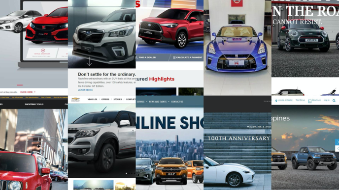
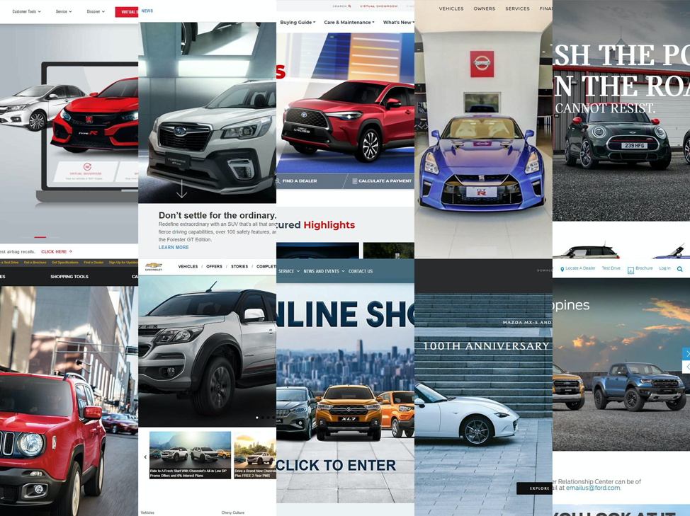
These days, websites are the best way to canvas or even purchase a car instead of getting appointments in different dealerships. If a brand’s website has everything the customer needs, they can make more informed decisions even before stepping into a showroom. This is the reason why we decided to look into the best car websites in the country.
For this comparison, we looked at the local car sites on a desktop and weighed in three main criteria. First is aesthetic. Does the website look good? How are the cars presented? Does the template compliment the information provided? Second is accessibility. This refers to how easy it is to navigate around the site and get the info you want. Basically less clicks and page loads, the better. Last is information. It looks at how in-depth the brands are with the details of their cars, including variants, colors, prices, brochures, quotation forms, and, if any, a digital showroom and/or auto loan calculators.
Out of all the brands available in the Philippines, we rounded them up to the top 10 (from over three dozen we checked out) that stood out. Here they are:
10. Suzuki
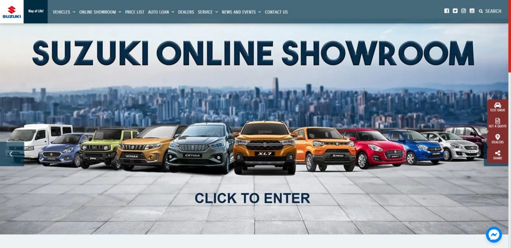
Suzuki’s website looks dated but makes for a good case of function over form — drop-down menu on hover, segmented single car page that has everything you need, no extra page to load. These are all strong points that ease the browsing experience.
Aesthetics aside, they’re at 10th place because of their non-interactive digital showroom. Click on it and it’s basically a compilation of already existing links. Some cars have a button for 360-degree view but it will only take you to the car page again. They also have partner banks indicated but there are no loan calculators or payment previews. That said, 10th place isn’t bad at all considering there are over 40 car brands in the Philippines, each with their own website.
9. Chevrolet
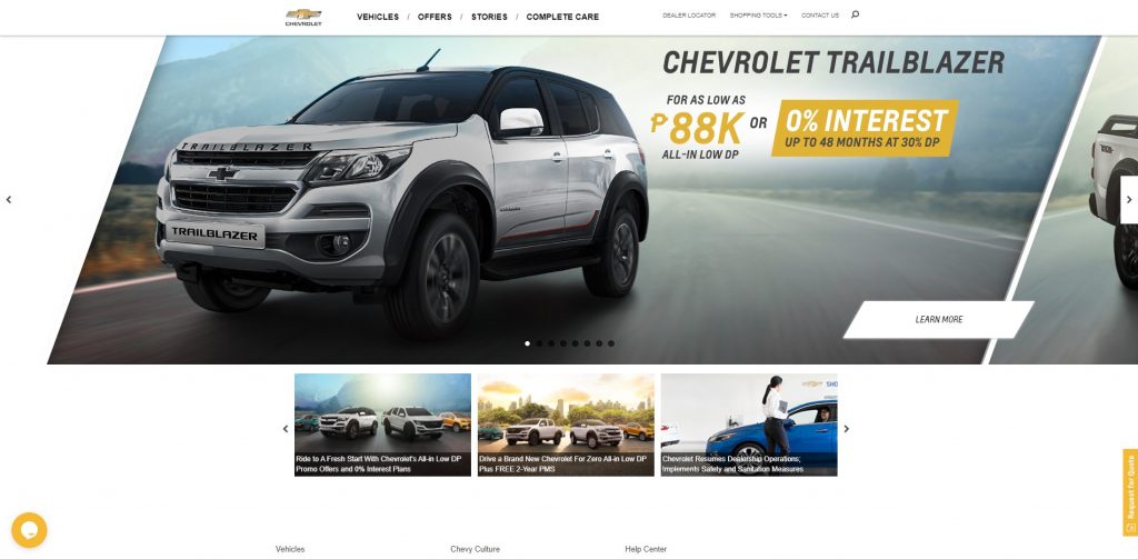
Chevrolet’s website looks good but not truly modern, with a very simple presentation all throughout. There are also a few pixelated images in some cars coupled with a few extra clicks to get around. The features are highlighted well and full specs are available but color previews are not available for all cars. The promos are presented early on, but further information regarding payment holds back the purpose of their “Shop.Click.Drive” program since that button (and their Ask Us button) goes to the same inquiry form.
8. Mazda
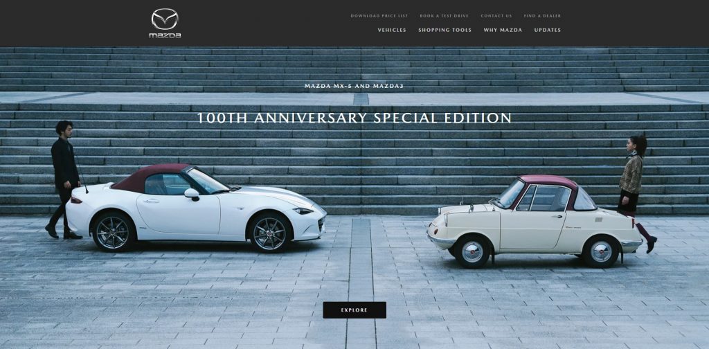
Just like their cars, Mazda’s website aims to be at par with that of premium and luxury brands but it’s hampered by aesthetics — of all things. Pixelated photos and videos are in some car pages like the Mazda2, Mazda3, CX-30 and even the CX-8, hampering the look of their sleek cars.
Another quirk is their clicky website. The landing page of the cars have a brief overview, with the highlights in another page that needs a lot of clicks to see everything. Thankfully the full specs for the variants and their starting price are available, though it’s also a couple of clicks away. The Vehicle Pricing feature of their Shopping Tools teases you for a detailed breakdown but it’s just another form.
7. Nissan
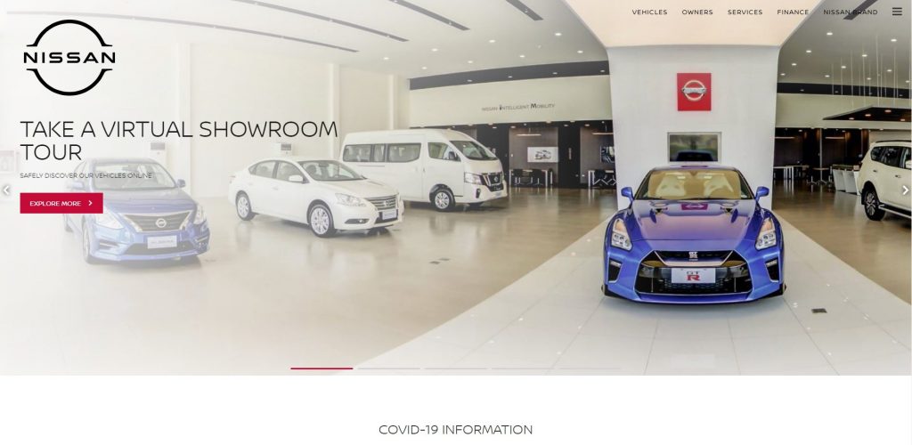
Nissan’s new website is as refreshing as their new logo. It’s very clean with lots of space to avoid being cluttered. The car pages have a quick brief on the vehicle with tasty photos, but it needs a few clicks in order to get everything you need to know the car. The digital showroom is very nice with little warping but you can only have a 360-view of the interiors. There’s also no loan calculator despite having a Finance section in the top menu.
6. Ford
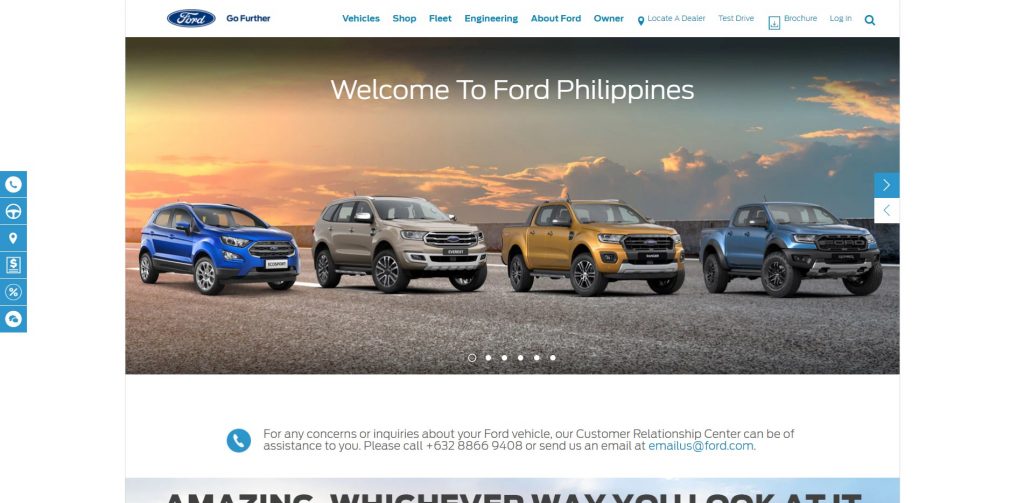
Ford’s website is pleasing to the eye thanks mainly to their cool blue color motif but once you look around, things will seem cramped. The top menu has barely any gaps, and the car pages are one image after another. The car landing pages still look nice, but you’ll do a lot of clicks to get the information you need. Prices are available even for the high-end models but there’s no pricing breakdown. However, they have a Build and Price feature that lets you select a vehicle together with accessories and you have the option to save it for the meantime or Request a Quote for that package.
5. Mini
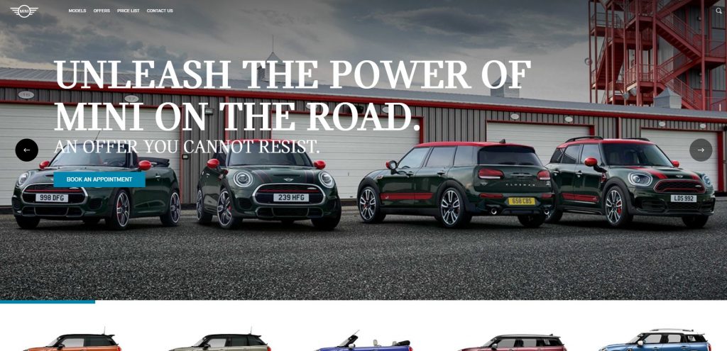
The distinct visual branding of Mini that you can see in their brochures translated well into their website, making for a really distinct look. Their car pages have hi-res videos and images, interactive color swatches, and easy flow of information for the overview. However if you wish to go in-depth between the trims, it will be difficult since the full specs are not readily available.
4. Subaru
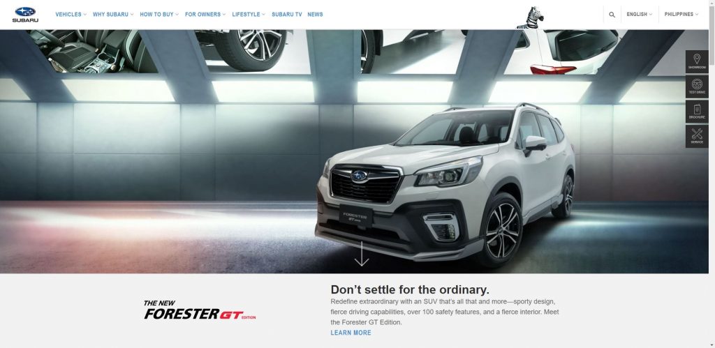
Subaru’s website let their images do the talking but there are a few interactive touches here and there. Their brochure needs your info, which I’m not a fan of, but it’s passable since the specs are complete on the car page alone. The prices are easily seen on the top menu and on a separate page, but not on the car pages itself, which is crucial specially for cars with multiple variants. They still prefer customers to test drive their cars before making a decision which explains why there’s no digital showroom or any payment schemes in their site.
3. Jeep
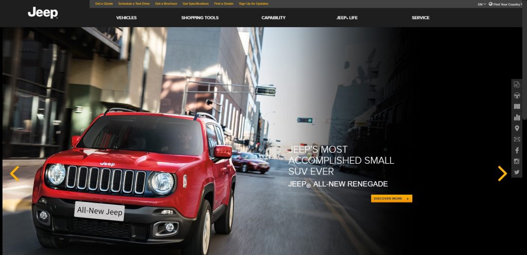
Jeep’s website is almost perfect. The homepage will greet you with dramatic hi-res photos and despite the dual layer top menu that becomes three-layer once you go to a car page, it doesn’t look cramped. The car page is segmented and the layout is very pleasing.
They could’ve ranked higher in the list if they had a more fluid accessibility and more information. The full specs button will take you to a page that loads forever without showing anything. Click the brochure from any car page and it will take you to another page that has all the cars and you have to select again. Then if you’re set to inquire, even if your link is from a specific model, it will ask you again what car you’re inquiring about. The intention is great but it’s too clicky and buggy on most car pages.
2. Honda
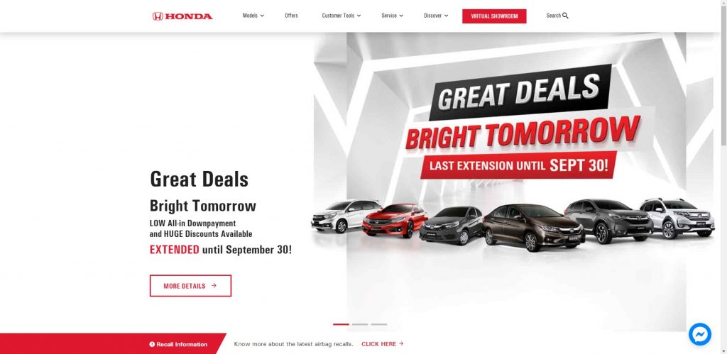
Honda could’ve had the top spot but they were severely hampered by their aesthetics. The layout is good, the digital showroom is very simple but effective, but the site is loaded with pixelated photos everywhere and bad composites for the car pages.
Look past that and it’s very tempting to buy a Honda straight from the site. Information is complete – with full specs for every variant, and a Facebook Messenger widget should you need to talk to an agent. The digital showroom is simple but will guide you from model to variant to payment schemes. There’s also a Loan Calculator that’s also accessible from the car pages to let you see a preview of the amortization and auto loan links to their partner banks.
1. Toyota
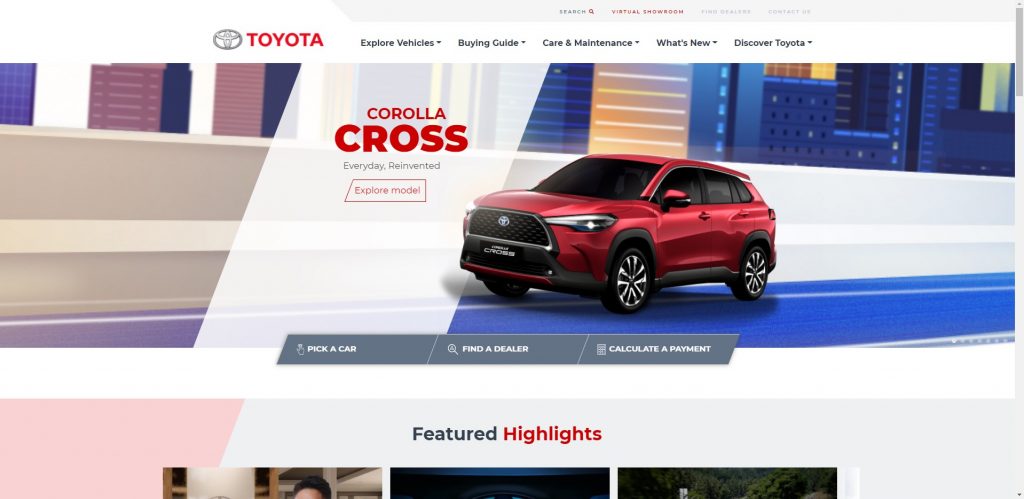
For a brand with a lot of models and things to promote, Toyota has a very pleasant website. The homepage alone has a lot of information but it didn’t look crowded thanks to wise use of sizing and alignments. Most of the images, especially in the car page, are composites but they are done well.
Information is almost complete showing variants, color previews, prices, and payment schemes immediately. The only fault they had, which is crucial, is the variant features. The complete specs are not available and even with the variant comparison, you’ll only see the rundown for engine, transmission, and dimensions which isn’t even half a car’s story. However, the brochure takes care of that though you’ll have to scroll up again to download it, which is still better than having to put information before seeing it. They also let you chat via a Facebook Messenger widget on the lower right of their site.
Overall, despite that shortcoming, Toyota comes out on top with its balance of aesthetics, ease of use, and lots of info you’ll have to help you with your next car purchase.


