Wearing your heart on your sleeve is an old idiom that dates back to Shakespeare’s time. It simply connotes that one should be upfront with their emotions and not try to hide it. Most of the time it’s said towards people who are shy and afraid of expressing their true self. Seldom is it utilized by corporations.
The recently established Aisin Corporation is a merger between Aisin Seiki, maker of automotive parts, and its subsidiary Aisin AW which specializes in making automatic transmissions. Together, they make more than 10,000 parts that are fitted into leading brands like Toyota, Lexus, Mitsubishi, Nissan, Isuzu, Ford, Volvo, Audi, GM and Chrysler which made them the leading OEM manufacturer. While other companies of similar magnitude would simply replace the text in all their assets, Aisin took it as a chance to change their image and wear their heart on their sleeve.
Beyond the font
Gone is the old logo that features a rectangular overall shape with a broken ‘A.’ The biggest difference with the new image is the rounded upper corners that bring a sense of unity and togetherness on both ends – values that’s attributed to all ranks within the company.
But the change isn’t only on the edges. Even the inner corners of the logo have been rounded to be more visually pleasing. Aside from being used by iPhones and the latest Windows 11, curved edges are closely associated with life since it’s reminiscent of fruits, some leaves, droplets. It’s aligned with one of Aisin’s goals which is happiness and beauty for the future of Earth.
Driven by the philosophy of ‘inspiring movement, creating tomorrow,’ the new logo is finished off with static movement. It’s done by utilizing italics for all letters and the subtle stroke on the ‘I’ to not make it look standing still. This motion in the letters itself evoke energy and drive for all members of Aisin and inspire them to achieve their and the company’s vision for a brighter future.
Triple A packaging
Just like in their logo, Aisin Corporation has significantly changed their packaging for their products. It now has a triple-A design as the backdrop for the parts, combined with its image, name, and the translation in several languages.
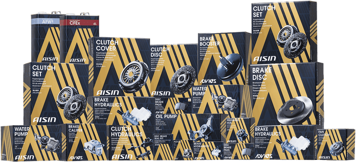
The design is not random. Apart from distinctly reinforcing the brand, the prominent triangle in the packaging symbolizes Aisin Group’s rise as a top company. Meanwhile, the slanted lines on one side refers to the collaboration between Aisin, Advics (manufacturer of ultra-premium OE brake systems) and Art (OEM of Pistons for car engines) who are collectively shaping the future of mobility and transportation with their products.
Within Reach
A slogan is the most concise representation of a company’s ideals and Aisin has always been about the future. Before, they were just geared up for it but they have become more inclusive after the establishment of Aisin as a corporation.
‘We touch the future’ is the new slogan for Aisin Corporation. Having ‘we’ in the beginning refers to all members of the company and indicates how everyone can contribute to the company’s goals and to a better future. ‘Touch’ stands for how everyone can shape that future with their own hands. It also implies how it’s now within reach instead of just gearing up for it.
Aisin is wearing its heart on its sleeve through their new logo, slogan, and packaging. It reminds everyone in the company how each of them is contributing to a bigger cause, while also showing customers the reason they’re the top OEM provider in the world. It’s not always just about great products, sometimes you have to show why you’re striving for such excellence. Aisin knows that and that’s why they tell their story in every box.